A draft you save on purpose
Typing sends nothing. The week is kept in your browser until you press Save, then saved in one go, so a figure typed, mistyped and fixed never becomes two corrections on the record.
Design
A timesheet is used every day by people whose real work is somewhere else. So every screen in ReliTime is built to be quick when you are sure and forgiving when you are not, on a laptop at a desk and on a phone on site.
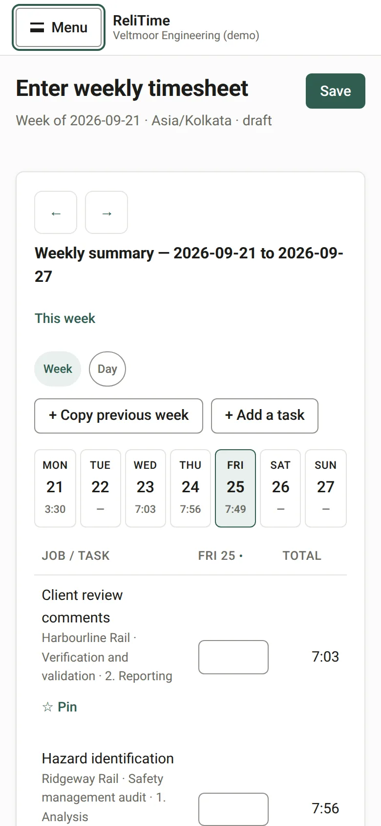
The weekly grid is built for the keyboard. Enter moves down a row, the arrow keys move between days, Escape forgets what you typed in a cell, and Alt+A opens the task list from anywhere on the screen. Type 7.5 or 7:30 for hours, or 45m for minutes.
The task list puts your pinned tasks first, then the ones you have used most in the last ninety days, and searches the rest by client, job or task name as you type.
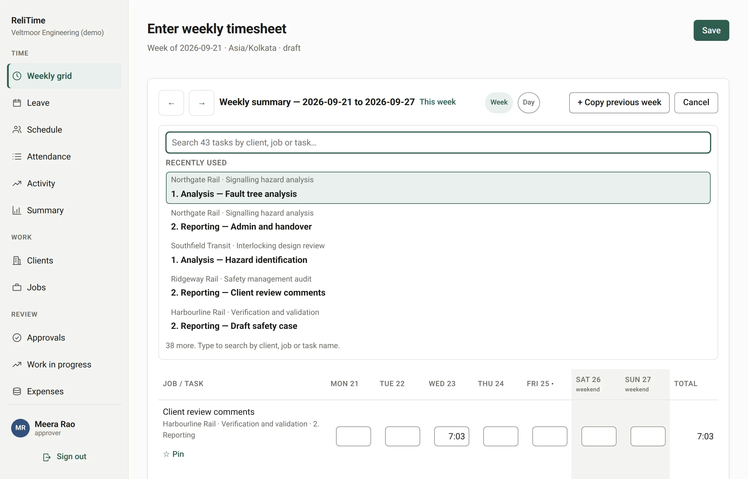
The day view draws each entry that has a start and a finish as a block on a timeline. Drag a block or use the arrow keys to move it, snap to five, fifteen, thirty or sixty minutes, and the hours are worked out from the times less the break.
An entry with only hours is listed under the timeline rather than drawn at a time nobody recorded.
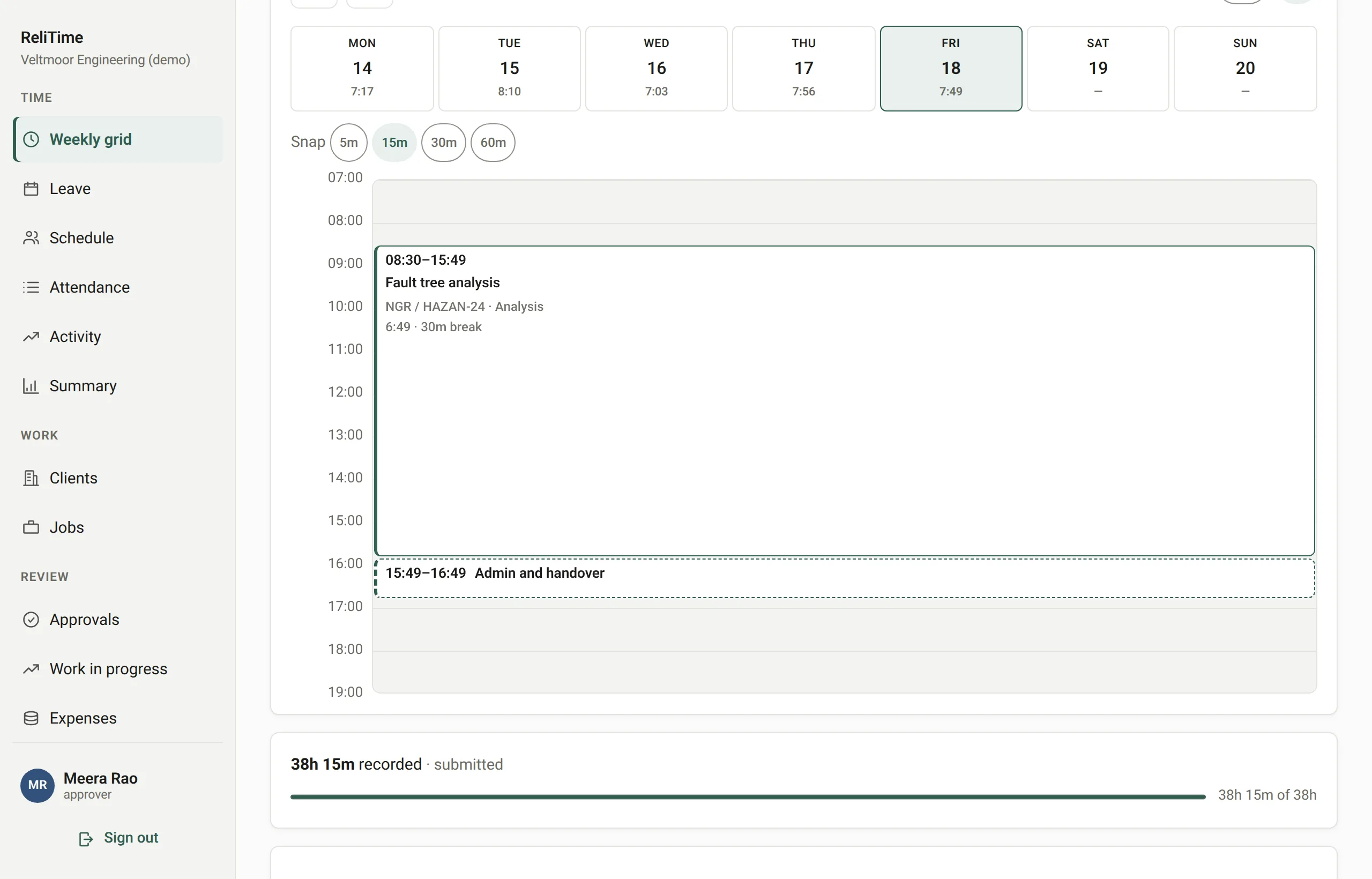
On a phone the week shows one day at a time, chosen from a row of days that each show their total. Buttons, the day chips and the task list are sized for a thumb: 44 pixels, where the accessibility guidelines ask for 24.
Time records are kept for years and corrected in the open, so the design keeps mistakes off the record instead of asking people to be careful.
Typing sends nothing. The week is kept in your browser until you press Save, then saved in one go, so a figure typed, mistyped and fixed never becomes two corrections on the record.
What Save just wrote is listed under the grid with an Undo beside each entry. A confirmation in front of every save teaches people to click through the one that matters.
Clearing a saved figure asks for the reason and records it. Hours over a budget are saved and flagged, never refused, because refusing the hours would only make the record wrong.
Submit becomes the main button once every working day has hours. Until then it names the empty days, so a forgotten Wednesday is caught before the week goes to an approver.
A week is checked for chargeable time with no note and for an empty day between two full ones, and little else, because a warning that fires every week is one people stop reading.
A budget nobody set shows a dash, not 0%. An overrun shows the hours over, not a bar stuck at 100%. A missing rate is named rather than priced at nothing.
ReliTime follows your device's light or dark setting. The screenshots on this page do too: switch your device's setting and they change with it.
Before each release, the application's screens are loaded at desk, tablet and phone widths in light and dark and checked automatically for overflow, alignment, colour contrast and labelling.
Every form field carries its label, so clicking the label reaches the field and a screen reader names it, and an error is tied to the field it is about.
ReliTime is sold with a walkthrough rather than a free trial. We will take you through a working organisation, from a week of timesheets through approvals and work in progress to a GST invoice, and answer your questions as we go.
Or write to hello@relitime.com.